Exploring Data: Michigan Traffic Accidents
Published on:Table of Contents
I know nothing about car accidents in Michigan, but together, we’ll be digging into some data. Depending how this post goes, this could be a pretty cool series as we dig repeatedly deeper. Keep the data dictionary close at hand, 60 columns is a lot to keep straight.
Similar posts: Visualizing Ann Arbor Incidents and Federal Register Data Exploration in R
The Setup
I’m using this post as an excuse to strengthen my R skills, so all the code will be R and the images will be made through ggplot2.
Everything to read and work with the data is done in the next couple lines.
library(tidyverse)
library(lubridate)
accidents <- read_csv("/home/nick/Documents/car_accidents.csv")
Is the Data Good?
The first question when given unknown data is how “good” is this data. “Good” is in quotations, since as a consumer we can only do so much to verify accuracy, but at least we’ll be able to confirm the data makes sense.
How many rows are we dealing with:
accidents %>% nrow() %>% format(big.mark=",")

# 484,513
and time range:
# Convert all the stringly dates into native dates
# and find the min and max dates.
accidents %>%
    transmute(date = ymd(acc_date_val)) %>%
    summarize(min_date = min(date), max_date = max(date)) %>%
    (function(inp) {
        start <- format(inp[["min_date"]], "%B %d %Y")
        end <- format(inp[["max_date"]], "%B %d %Y")
        paste(start, end, sep = ' - ')
    })

# January 01 2013 - August 31 2014
Interesting that the data time range falls short of two years.
According to the data dictionary there are several fields that are paired together, for instance a column for indicating whether this was a fatal accident, and another column for listing how many fatalities. Why the curator decided to split information into more than one column is beyond me. So we’re going to check that when a fatal accident has occured the number of fatalities is above zero, and that reverse is also true (when the number of fatalities > 0 then the accident is marked as fatal)
accidents %>%
  filter(acc_fatl_crsh_ind == 1 && acc_num_fatl == 0) %>%
  nrow()

# 0

accidents %>%
  filter(acc_fatl_crsh_ind == 0 && acc_num_fatl > 0) %>%
  nrow()

# 0
These same validation constraints can be applied to other columns based on what the data dictionary tells us:
- day_of_week is 1-7 with 1 being Sunday. This can be corroborated with the date_val.
- Whether an injury occurred and how many can be checked in the same manner as fatalities.
- Certain fields are fine to be null, so warn on those that shouldn’t be null.
It’s also good to check for duplicates
accidents %>% distinct(acc_crsh_id) %>% nrow() == accidents %>% nrow()

# TRUE
With 60 columns of all varying definitions, one could continue near ad nauseum. As someone who has written a csv validator based on a data dictionary similar the one for car accidents, I should dedicate a post for the best methodologies! The point of this post isn’t all the various validations that can be done but to get a good feel of the quality of the data (and all signs are positive).
The Question
Is there any correlation between the date and time of the crash and the number of fatalities?
Before we get into the visualizations, we need to do some data cleanup. The date and time are split into separate columns and the time is kept in military time, but the column is a string so I’m somewhat suspicious that not all values are numbers. Let’s find all the non-numeric values in this column
accidents %>%
  filter(is.na(as.numeric(acc_milt_time))) %>%
  count(acc_milt_time)

#   acc_milt_time     n
#           <chr> <int>
# 1           UNK   469
# 2          <NA>   137
469 + 137 = 606 accidents out of 484,513 (0.1%) have an unknown time. Since so few accidents are affected, filter out these anomolies.
accidents <- accidents %>%
  mutate(time = as.numeric(acc_milt_time)) %>%
  filter(!is.na(time))
To answer our question about if there is any relation between date and time of accident and the number of accidents and fatalities, we convert the data into a native date object.
accidents <- accidents %>%
    transmute(
        date = ymd(acc_date_val) +
            dhours(trunc(time / 100)) +
            dminutes(time %% 100),
        fatalities = acc_num_fatl)
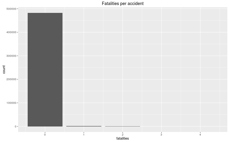
It’s nice that we’ve transformed the data, but we still have no idea what the data actually looks like, so let’s create a bar plot of the number of fatalities per accident.
accidents %>% ggplot() + geom_bar(aes(fatalities)) +
  ggtitle("Fatalities per accident")

Fatalities per accident
By itself, this graph has little value as it shows the vast majority of accidents result in zero fatalities, which is great! We can also guess that the max number of fatalities in an accident is four, but to get a better insight of the data where anything that is not zero is an outlier, we’ll view the data as table of counts and frequencies of occurrences.
accidents %>%
  count(fatalities) %>%
  mutate(freq = round((n / sum(n)) * 100, digits = 3))
  fatalities      n   freq
       <int>  <int>  <dbl>
           0 482451 99.699
           1   1364  0.282
           2     79  0.016
           3      9  0.002
           4      4  0.001
Zero fatalities occur in 99.7% of accidents. Even when there is a fatalities there is a large drop off between them. Between 1, 2, and 3 fatalities there is an order of magnitude of difference in frequency. This may bring up a morbid question, but why the does the data exhibit this behavior and why is there not a magnitude order of difference in 3 vs 4 fatalities? Is it related to the number of vehicles in the crash and/or the total number of occupants (eg. the probability of there being three people in the car is about the same as four)? These are great questions that can be explored in a later post, as we’re only interested in datetime and fatalities, but it’s good to always be asking questions to discover new insights.
Since we’re dealing with an odd time range (January 01 2013 - August 31 2014), we have to be careful to not group by just the month of the accident as that would omit September - October of the 2014 year, so would appear to contain less accidents.
accidents %>%
  count(month = as.Date(floor_date(date, unit = 'months'))) %>%
  ggplot() +
  geom_line(aes(month, n, ymin=0)) +
  scale_x_date(date_labels = '%b %Y', date_minor_breaks = '1 month') +
  ylab('accidents') +
  ggtitle("Accidents per month")

Accidents per Month
Distribution appears to be bi-modal with an increased number of accidents occurring in the winter, which makes intuitive sense because winter tends to cause poor road conditions begetting accidents.
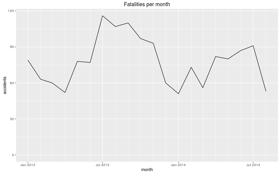
Now fatalities, which, as you remember, account for only 0.3% of all accidents.
accidents %>%
  group_by(month = as.Date(floor_date(date, unit = 'months'))) %>%
  tally(fatalities) %>%
  ggplot() +
  geom_line(aes(month, n, ymin=0)) +
  scale_x_date(date_labels = '%b %Y', date_minor_breaks = '1 month') +
  ylab('fatalities') +
  ggtitle("Fatalities per month")

Fatalities per Month
Interestingly, January 2014 had the lowest number of fatalities but the highest number of accidents. The same is true for fatalities, July 2013 had the highest number of fatalities, but was a local minimum for accidents. Could there be a negative correlation between the number fatalities and accidents? Certainly sound counter-intuitive.
Let’s look at accidents per day.
accidents %>%
  count(month = as.Date(floor_date(date, unit = 'days'))) %>%
  ggplot() +
  geom_line(aes(month, n, ymin=0)) +
  scale_x_date(date_labels = '%b %Y', date_minor_breaks = '1 month') +
  ylab('accidents') +
  ggtitle("Accidents per day")

Accidents per Day
Notice the sharp jags that look like they occur every week, so let’s break it down by day of week.
accidents %>%
  count(day = wday(date, label = TRUE)) %>%
  ggplot() +
  geom_bar(aes(day, n), stat='identity') +
  ylab('accidents') +
  ggtitle("Accidents per weekday")

Accidents per day of the week
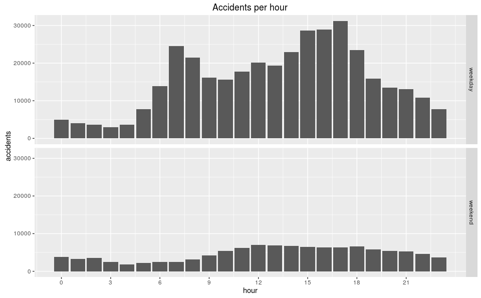
This confirms the weekly dips are due to there being fewer accidents on the weekends. Maybe that is because there are fewer travelers, but we’d need supplementary data for that. Breaking it down by hour should give us a better notion if our intuition about the number of drivers is not far from the mark.
accidents %>%
  mutate(hour = hour(date),
         wd = wday(date),
         dtype = ifelse(wd == 1 | wd == 7, "weekend", "weekday")) %>%
  ggplot() +
  geom_bar(aes(hour)) +
  ylab('accidents') +
  scale_x_continuous(breaks = c(0, 3, 6, 9, 12, 15, 18, 21)) +
  ggtitle("Accidents per hour") +
  facet_grid(dtype ~ .)

Accidents per Hour
The weekday graph is bimodal with peaks during rush hour (more drivers on the road), whereas the weekend graph is more normal. This gives our intuition more credit (though doesn’t confirm it).
Conclusion
Conclusion, already!? I feel like I’m 10% of the way through the analysis and this is a good stopping point. We know what some of the data look like and we have a list of questions:
- How is the number of fatalities related to the other parameters (total occupants, type of accidents, weather)
- If given all parameters but the number of fatalities, could we predict the number?
- Is the number of accidents correlated to the number of drivers on the road more than anything?
These questions may be used to fuel further analysis.
Comments
If you'd like to leave a comment, please email [email protected]