CycleList: a cyclical activity tracker
Published on:I, unironically, wrote a todo app: CycleList.
This was only after trying and failing to find an app or site where I could have a sequence of unscheduled tasks where completing a task would have it fall to the bottom of the list with an updated completed time. Tasks completed least recently then bubble up to the top, creating a sort of cycle. Hence the name, CycleList.
Use cases for this could be: recipes, restaurants, workouts, cleaning, board games, tv shows, and really anything else where one thinks “huh, I haven’t done that in awhile”.
My main use case is for passively maintaining side projects. I have about two dozen of them and I’d like to spend an average of 20 minutes per month on each of them. This mostly consists of updating dependencies and making sure it still works, but sometimes I widen the scope to freshen up the code, try new technologies, or add a feature.
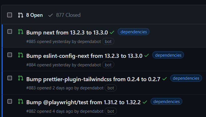
I had been using dependency notifications as a signal to update a project, but getting inundated with dependency update emails is fatiguing. One email for opening the PR and then potentially one or more from Cloudflare or Vercel informing me of the preview deployment. Even if one directs these emails to a low priority queue, the noise seeps into the project PR management.

A project with noisy dependency PRs
It would be terrible if an actual contribution was drowned out.
I suppose on the flip side, it’d be a fine time to pad the résumé by bragging about how many PRs one’s project has garnered.
I’m not normally one to post memes, as I’m woefully bad at it, but this is too good of an opportunity not to try.

You have 900 dependency PRs. I have 900 contributor PRs. We are not the same.
(In case there is ambiguity, the meme is poking fun at myself.)
So instead of tweaking the dependabot config to ignore patch updates, you created a todo app?
I feel like that misses a bit of nuance, but I suppose that’s right. I could fire back about wanting to update transient dependencies, but I know one doesn’t need flawless reasoning to create a side project. The act of creation is enough.
Normally, my side projects and blog posts have some technical challenge or performance aspect to them. Wasm compression benchmarks and minimizing allocations in Wasm being two recent ones.
CycleList, while not technically challenging, was a breath of fresh air as I instead focused on making an aesthetically pleasing site with good user experiences (ie: a bit of juice). It was the first time I interacted with several dependencies:
- dnd kit to allow users to reorder their lists and items within a list
- @formkit/auto-animate which animates how a list is rearranged after items are added, moved, completed, or deleted.
- Radix via shadcn/ui for an alert modal prior to list deletion
I kept the rest of the stack the same as my other projects: Next.js + Tailwind. No need to try too many new things at once.
One challenge I had for user experience was mobile. Drag and drop is not particularly ergonomic, or at least it is difficult to get right. Another difficulty is that the trash icon of a list item is only revealed on hover (or focus) so that the UI isn’t overwhelmed with icons. However, hover is not really available on mobile.

List item stable state

List item hover state
At first I was nervous I’d need to use screen size as a heuristic to know if the client could hover, but then I stumbled upon the hover CSS media feature:
@media (hover: hover) {
  /* when hover is supported */
  a:hover {
    color: white;
    background: black;
  }
}
Then I realized I could leverage the technique discussed in my Designing Responsive React Components for 2023 article, where a UI for hover enabled clients is rendered simultaneously as the UI for hover disabled clients. That way there won’t be a flash of uninitialized content.
In this case, clients lacking hover will see a chevron to move list items by a single position, and the trash can will always be visible.

Mobile list item state
The hardest task was figuring out what incantation was needed for tailwind to cooperate, but I prevailed in the end.
return (
  <>
    <button className="[@media(hover:none)]:hidden">
      {/* Hover-enabled button */}
    </button>
    <button className="[@media(hover:hover)]:hidden">
      {/* Hover-disabled button */}
    </button>
  </>
)
I feel pretty good about this and CycleList in general. I made it for myself, and I’m a happy user.
I do have one small rant before wrapping up. There’s a total of 350KB (118KB compressed) of JS and CSS to run CycleList. I have done no work to optimize this size. Next.js is not the lightest weight React framework and React isn’t a lightweight library. I’ve been liberal in the amount of dependencies used.
Despite not caring about size, CycleList is smaller than several 3rd party widgets on my employer’s ecommerce site, and this boggles my mind. What are these other developers doing? Why is an application smaller than a widget? What’s the point of creating a performance budget when any improvements won’t move the needle.
Maybe this is an opportunity. Author a tight widget and take all the performance minded customers from your competitors.
Comments
If you'd like to leave a comment, please email [email protected]