First Impressions of the Google Pixel
Published on:Table of Contents
I wasn’t lying when I said I was getting rid of my old Windows phone and grabbing myself a Google Pixel. I’ve had a wide range of emotions as I’ve been exploring the phone and ecosystem. It’s been less than a week, and things have been great, though there are still some rocky areas. This post mostly serves my needs for documenting my journey to a new platform.
Setup
I’m not sure how to correctly share my setup, so I’ll have to make do with just my pictures and words!
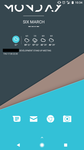
Let’s start with my home screen.

My Home Sreen
- Nova Launcher Prime - $4.99
- Zooper Widget Pro - $2.99
- Whicons icon set
Clicking each of those icons will lead you to the default app (messenging, email, internet, and camera). Swiping up on each icon will bring a selection of other apps (screenshot below). This allows for a minimal home screen setup, yet having frequent apps at only a swipe away.

Swipe up on icon to access additional apps in category
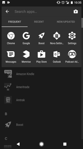
Swiping up anywhere on the screenshot (aside from the folders) brings up a list app drawer, reminisicent of Windows Phone.

Swipe up to see all apps installed
Widgets:
- Today’s date (without time!) is from the Ocea zooper set. Not 100% I’ll keep it – almost looks too trendy, but there seemed to a be a severe lack of widgets that showed just the date. Maybe they expect the user to delete the time elements in the zooper widget?
- Heavily modified side info widget from the Parrot zooper widget collection to just show my next calendar item in two lines of text: the event description and event time. In hindsight, this is probably one of the easiest zooper widgets to create, so I could have started from scratch! Clicking on the text will bring up the calendar app. I wish it would open the event!
- The forecast is from the material style widget pack. I also modified this widget such that the background became transparent. To do this, I had to figure out to take a screenshot, watch it upload, download on computer, open it up in paint to use the color picker functionality. I may have to replace this widget in the future as there is a bug when the forecast encompasses two months and the next month will have the previous month’s label. Clicking on the forecast will bring up a weather app.
- I wish there was a widget where all it was an up or down arrow with the percentage representing the dow jones market activity for the day. Sometimes I forget to check on the market (which is not a bad thing), so as long as I get a sense for what the market doing (even at an artificial level), I’ll be satiated. If you haven’t gotten the feeling already, I’m into simplicity
Are these serious widget flaws? No, but I’m still not 100% satisfied, so I may look for future improvements. There are other widget tools out there, like KWGT. A reddit comment sums up the choices:
If you plan on primarily using other people’s widgets, then Zooper has a better library. However, if don’t mind the smaller selection and prefer creating your own widgets, KWGT is clearly the top.
KWGT has better tools, more functionality, and it is supported by an active dev. I would say it’s a little more complex than Zooper, but only because it provides so much functionality compared to Zooper.
Zooper is older than KWGT, and it has more widgets, but the dev of Zooper has pretty much abandoned it. It’s also a inferior product compared to KWGT, but it IS easier to use. I’d recommend buying KWGT and making the time investment into learning that. (By the way, KWGT is significantly easier on the battery than Zooper, which was very important to me).
Maybe in the future I’ll look towards KWGT, but right now I’m not noticing the battery issue and I’m not interested in continuously shelling out money for widget makers.
Apps
I’m not a big apps user (maybe because I was a Windows Phone user for four or so years). Now that I have access to a much larger ecosystem, I didn’t expect it to change, and for the most part it hasn’t, but I have started a collection.
- I can use the Amtrak app again (it was removed from the windows store)
- I can use the Chase app again (it was also removed from the windows store)
- Take pictures of checks for my bank
- Brokerage app
- Memrise (highly recommend checking it out for learning a language)
- Ventra app for Chicago transit
Overall the app quality is much higher than windows store apps, which should come to a surprise to no one. What I do find suprrising is that I felt like most of my apps on windows phone didn’t have ads, but I can’t seem to find an equivalent free app with no ads in the android ecosystem. I’m mostly thinking of podcast and weather apps. I’m somehow put off by the ads in these apps. And it’s not that I’m against paying for apps, as can seen by my purchases in the customization department. The thought of paying for every single app to get an ad-free experience is exhausting. I wish that I could pay a small fee to google and get an ad free experience across all apps. Something like the Brave browser’s Ad Replacement program.
Deficiencies
- Google calendar can’t call all forms of Webex’s correctly. It sometimes enters in the phone number as the access code. This wouldn’t be as annoying if I could paste the access code into the dialer, but once a call has started, one can’t paste into the dialer. Simply infuriating. iOS and Windows Phones solved this problem eons ago. I know there are third party phone apps, but I don’t want a third party app. I want Google to grow up, start supporting first party apps, and get feature parity with Windows Phones. That sentence was a bit harse, but users of Samsung phones and their calendar app have no problems with dialing in the access code. If Samsung can do it, Google should too. I’ve been able to work around it somewhat using Multi-Window mode, where I have the phone app and the webex event opened side by side so that I can type the access code without memorizing it. I’m afflicted by first world problems.
- Speaking about calendars, I have a calendar through my personal outlook account, where I keep track of plane tickets, train tickets, and other odd events. Turns out Google calendar doesn’t support non exchange calendars. What’s even a bigger bummer is that I can’t change the default calendar app to point to the outlook app so that my zooper widgets can pick up on them. Why Google!? Another feature set that both iOS and Windows Phone implements. Creating another calendar backend should be an intern project. Here, I’ll get the intern started: Outlook Calendar REST API reference
- I want to be able to swipe left to bring up the App Drawer
- Customize the lock screen just a tad bit. Maybe bring the time to lower left hand corner like Windows Phone.
Yes, scathing words were used, but if those couple of issues with the google calendar app can be fixed then I’ll write off the others as quibbling, and I’ll have no regrets.
The Camera
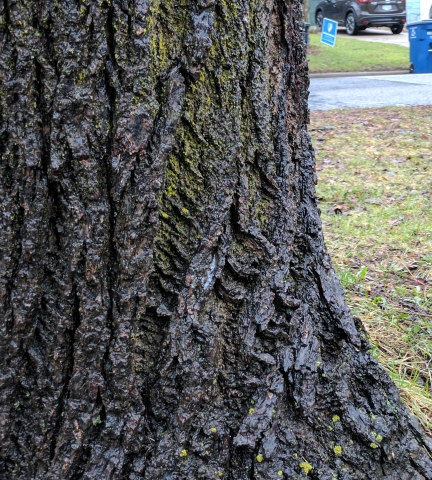
The hype is real here. I’m purposely taking pictures in low light!

Picture of a tree taken in low light, it looks decent
Features I don’t use
Looking at a Verge’s article on features, here’s a list that I don’t use.
- Google Assistant: I’m not on the voice train yet. Though I do use a very similarly named feature called the Google Wifi Assistant, which allows one to connect to open wifi networks securely using a Google VPN.
- Google Daydream: Not on the VR train either
- Pixel Launcher: Nope. Using Nova Launcher Prime
- 24/7 voice support: Hopefully I’ll never have to use this!
And these features are just the ones that are unique to Google phones. Imagine the number of Android features I’m not using!
The phone has be great so far, not spotless, but I’m excited for what the future brings.
Comments
If you'd like to leave a comment, please email [email protected]