Decapitation: a migration from antd to headless story
Published on:Table of Contents
The modern web is so complex, there came a time when updating to either the latest Ant Design 4 (antd), or latest Next.js 13.4 version would cause PDX Tools to completely break with a nonsensical error. Something about a tooltip. After a couple hours searching the web and tinkering, no solution was in sight. A frustrating and humbling experience (or humiliating depending on how you look at it).

The tooltip fails to import from Next.js 13.4.2 to 13.4.8
Who’s to blame? I don’t know. I previously railed against the buggy nature of Next.js when it came to web workers. Despite Next.js eventually fixing these issues, I have come to terms that the strange bugs one encounters when using such an encompassing meta framework like Next.js are a way of life. This is not to disparage Next.js. The web is a messy, volatile place, and providing a facade over that is no small feat.
At this point, I had the following options:
- Stay on these specific Next.js and Antd versions, and periodically attempt to retry updating to the latest minor/patch versions. This would be a good choice for any project that is passively maintained.
- Perform a major migration to Antd 5, and hope it solved the issue (hint: it does).
- Remove Antd components in favor of headless components
I first upgraded to Antd 5, but wasn’t terribly impressed as each page saw a marked increase in bundle size, so I embarked on a several week process to replace all Antd components.
At the end, I put together a table with bundle sizes (in kB) of the home page, the main app page, what Next.js reports as the first Load JS shared by all, and the total percent change from the status quo.
| Home | App | Shared | % | |
|---|---|---|---|---|
| Baseline | 376 | 544 | 200 | |
| Antd 5 | 419 | 634 | 134 | +6% |
| Headless | 255 | 354 | 138 | -35% |
My initial reaction to Antd 5 being more bloated was a bit of an overreaction, as the increase in page bundle size comes from the shared bundle JS. However, a 35% decrease in JS from removing Antd is nothing to be snuffed at.
There are other issues that have caused the Antd ecosystem to gradually sour on me. @ant-design/charts has a peer dependency on Antd 4 and it’s causing a bit of a headache. I should stop myself before ranting about charting libraries. I adopted Antd with the thought of getting a packaged deal. Now I see myself backpedaling after a couple years.
Antd 5 adopting CSS-in-JS doesn’t sit well with me. I’m cautious about anything incorporating CSS-in-JS as it is a bit of a trap for dynamic values. Even if Antd 5 executed CSS-in-JS perfectly, the changes required to support server side rendering are unappetizing at best. Antd 4 distributing styles through a single already compiled stylesheet is tantalizingly simple. Call it clunky, call it bloated, call it old school, but any environment can trivially incorporate a stylesheet.
Headless via Radix and shadcn/ui
I pride myself in being a developer who is well versed in accessibility. And it seems the more I know, the more nuance there is too. It can be tempting to slap a couple ARIA attributes on an element, but remember: “No ARIA is better than bad ARIA”.
To my rescue are headless component libraries. Some are hook based like React Aria, while others are component based like Radix. Both accomplish the same task, let them handle the component’s behavior and accessibility, while we handle the styling and occasionally the state.
If we’re going headless, there are a lot of components to replace:
- Data tables with sorting, filtering, and pagination
- Dropdowns
- Drawers
- Modals
- Navigation Menu
- Slider
- Switch
- Tabs
- Toggle Groups
- Tooltips
Radix covers a good number of these, and so provides a strong foundation. For the components that Radix doesn’t provide, we can stitch together other headless libraries like cmdk for a combobox and TanStack Table.
Instead of styling from scratch, we’ll copy and paste code from shadcn/ui component templates which provides a nice set of styles for Radix, cmdk, and TanStack Table. From there, it’s mostly a task of tweaking spacing, colors, borders, and icons. Most of it is straightforward. During the mechanical transformation from Antd’s API to our API, there were plenty of opportunities to improve accessibility by falling into the Pit of Success.
Compare how Antd structures a drawer:
return (
  <>
    <Button type="primary" onClick={showDrawer}>
      Login
    </Button>
    <Drawer title="Welcome back!" placement="right" onClose={onClose} open={open}>
    </Drawer>
  </>
);
Do you see how the only thing linking the button and the drawer together is javascript? Screen readers won’t be able to connect the dots that the drawer is controlled by the button.
This is how our API solves this:
  return (
    <Sheet modal={true}>
      <Sheet.Trigger asChild>
        <Button>Login</Button>
      </Sheet.Trigger>
      <Sheet.Content side="right" className="...">
        <Sheet.Header>
          <Sheet.Close />
          <Sheet.Title>Welcome back!</Sheet.Title>
        </Sheet.Header>
        <Sheet.Body>
          {/* ... */}
        </Sheet.Body>
      </Sheet.Content>
    </Sheet>
  );
Our API clearly documents the structure and behavior of our code, so Radix can confidently annotate with the correct ARIA attributes. If we wanted the same level of accessibility in Antd, we’d need to handwrite the following attributes:
aria-haspopuparia-expandedaria-controlsaria-labelledby
Is our API more verbose? Yes, but much more flexible and accessible, which makes the tradeoff worth it.
There was no free lunch, however, as detailed in the “difficulties” section.
Don’t worry if any of the libraries mentioned are new to you. In the talk, Off with Their Heads: Rise of the Headless Components, other than being an inspiration for this post’s title, has a clip where the speaker is asked about their thoughts on shadcn, and they confess they aren’t familiar with it.
And funny enough in the talk, Antd is used as the example that makes headless components compelling in comparison.
Tailwind Dogma
Let me enter the eternal tailwind drama with what could be a helpful viewpoint.
Tailwind, as a tool, is inherently neither good nor bad, but if it is a hammer, sometimes everything looks like a nail and usage may be awkward. For instance, in shadcn’s Command implementation, which is based on cmdk, there is a long class string. I’ve taken the liberty to break it up onto multiple lines for you, dear reader:
[&_[cmdk-group-heading]]:px-2 \
[&_[cmdk-group-heading]]:py-1.5 \
[&_[cmdk-group-heading]]:text-xs \
[&_[cmdk-group-heading]]:font-medium \
[&_[cmdk-group-heading]]:text-gray-400
Broken up onto multiple lines, it doesn’t look so bad. But the problem is that the cmdk-group-heading attribute selector is unique to Command. Nowhere else in the codebase will this class name be referenced. Thus, it is a shame that tailwind will include this in our global stylesheet. There are plenty of pages that don’t use a Command, why should these pages also need to parse and apply such specific CSS? Now imagine that most components were styled with these hyper-specific class names. Our global CSS would never stop growing!
Instead, I decided to leverage both tailwind and the builtin Next.js CSS modules:
.heading [cmdk-group-heading] {
  @apply text-xs text-gray-400;
  padding: theme(spacing[1.5]) theme(spacing.2);
  font-weight: theme(fontWeight.medium);
}
I even used @apply wherever a tailwind class expands to more than a single line of CSS.
While you could argue that there’ll be more or less the same CSS in total, it’s more important to me that component specific styles aren’t polluting the global stylesheet.
And when I’m talking about component specific, I’m not including styling based on generic data attributes that could be shared amongst many components:
data-[state=open]:text-sky-500
Many components could have an open state, thus the class is reusable and fine to include in the global stylesheet.
I don’t fault Shadcn or other component templates for overly long or specific class names. What other option do they have? CSS modules aren’t ubiquitous, so requiring a specific environment (ie: Next.js) or additional dependencies seems too constraining. Strictly only using tailwind seems like a reasonable approach. I think that is a benefit of Shadcn positioning itself as a template as it is expected for the consuming developers to massage it to fit not only their design language but their environment.
Difficulties
Along the way, many difficulties were faced. Enough that made me realize that some of the value add from UI frameworks like MUI and Antd are to handle these for you.
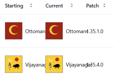
For instance, I had an infuriating hour or two trying to figure out why table cells had overrunning text that Antd didn’t.

Table difficulties with text overrun
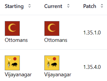
Sometimes the solution is a different design. Nothing like throwing a display: inline-block as a fix:

Move text below image in table
Another example is that I couldn’t figure out how to anchor a navigation menu to its right side instead of its left, so it wouldn’t overflow the page. I decided the easiest fix was to push the whole menu to the left so there’s enough room.

Menu difficulties with positioning
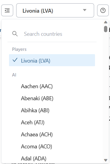
There is difficulty in handling lists with many elements. One such component is the search over nation states which contains about 1400 items. Antd automatically virtualizes the list, so the latency between the click and the display is incredibly snappy. There are dedicated virtual libraries that provide similar functionality, but now one needs to figure out which library is best suited for the use case. In the interest of time, I was able to eschew virtualization and present a list of around 700 items without loss of functionality and too much latency.

List that is good candidate for virtualization
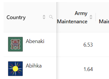
Sometimes you don’t realize a responsibility a headless component pushes onto you until too late. Frozen columns in tables is one such example. I thought TanStack Table supported it, but merely referred to them as pinned columns. No, I was incorrect, there are no plans to support the concept natively. If I hadn’t decided to drop the notion of frozen columns, I could have used one of the community discussions as inspiration.

Table with a leading frozen column
Conclusion
Looking back, I see a lot of failures. If something wasn’t quick or easy to port, I either dropped or reworked it. What does that say about me as a developer!? Certainly sounds lazy.
While that can be partially true, my perspective is that the initial port didn’t need to be perfect day 1. All the listed problems certainly seem solvable if more elbow grease is applied, and can be tackled over time. Of course, that is time that isn’t being spent developing features, but there’s no telling if that time would have been wasted over fighting an Antd quirk.
That’s why, like any level headed developer, I’m not advocating for everyone to drop Material UI and Antd. Having a sensible, out of the box component library that one can stitch together is a boon to use cases where the UI may not be the main focus. If a component library is getting in the way of you writing features, it’s time to re-evaluate that relationship.
While not trivial, it’s never been easier to create your own accessible, flexible, and ergonomic component library.
Comments
If you'd like to leave a comment, please email [email protected]